top of page
LOCATE
A web product to help discover curated locations in your area.


OVERVIEW
Locate is a web based product designed to assist people with discovering curated, personalized locations and businesses wherever they are.
PROBLEM
-
Other map products offer the user a glut of location options with no way to filter the locations based on user preferences
-
There are currently no products that offer suggested locations based on user taste and previous locations that they have enjoyed
GOALS
-
Create a way for users to quickly find locations that they are actually interested in in their local area
-
Create a more personalized and rewarding map experience
-
Allow users to quickly gain in depth, relevant knowledge of a location that would otherwise take months or years to obtain
ROLE
Lead product designer
TIME FRAME
3 months
INDUSTRY
INDUSTRY
A social location discovery web app
HOW IT WORKS
New users complete an on boarding quiz when they sign up. The quiz helps create a profile for the user and allows them to begin receiving personalized recommendations.

CURATED EXPERIENCE
Next, the user is brought to a personalized and customizable dashboard. Here they are able to view suggested locations in different categories and and organize their own list.

MAP
The dashboard also has a second section where locations that are suggested, as well as locations from the user’s list, are visible as points on a map. This enables the user to quickly tell if they are close to any of their suggested or previously saved places.
The dashboard also has a second section where locations that are suggested, as well as locations from the user’s list, are visible as points on a map. This enables the user to quickly tell if they are close to any of their suggested or previously saved places.

User reviews and ratings further personalize suggested locations.
Locations can be saved and added to personal list directly.

WHO IS IT FOR?
Locate is for anyone who is interested in exploring the area where they live. Whether they have just moved to town, are traveling through a new city, or are simply looking for hidden gems they may have missed.
01 RESEARCH
USER INTERVIEWS
Conducted interviews with people who had recently moved to a new location and Learned about how they felt about the process of adapting to a new location.
COMPETITOR ANALYSIS
Analyzed three main competitors in the field to identify a gap in the market.
INSIGHTS FROM INTERVIEWS
1. It can be easy to overlook some of the best aspects of an area even if you have lived there for a while, due to the fact that A: only the most popular places come up in searches and B: the searches can turn up too many different options with no good way to tell what is worth visiting.
2. It can be difficult to meet people when working from home is so prevalent. This means it can take longer to gain insider information about a new location.
INSIGHTS FROM COMPETITIVE ANALYSIS
GOOGLE MAPS
PROS
Extremely comprehensive
FOURSQUARE
Easy to use UI
YELP
Lots of Reviews
CONS
Too many options/no curation and ratings are essentially meaningless
Recent updates seem to have alienated users
Easy to game review system/Difficult to tell if reviews are high quality
AFFINITY MAPPING
An affinity map was created to more easily make sense of the information collected.

02 DESIGN
SITE MAP
A site map was developed to begin to create the information architecture of the product and visualize the general layout of the pages.

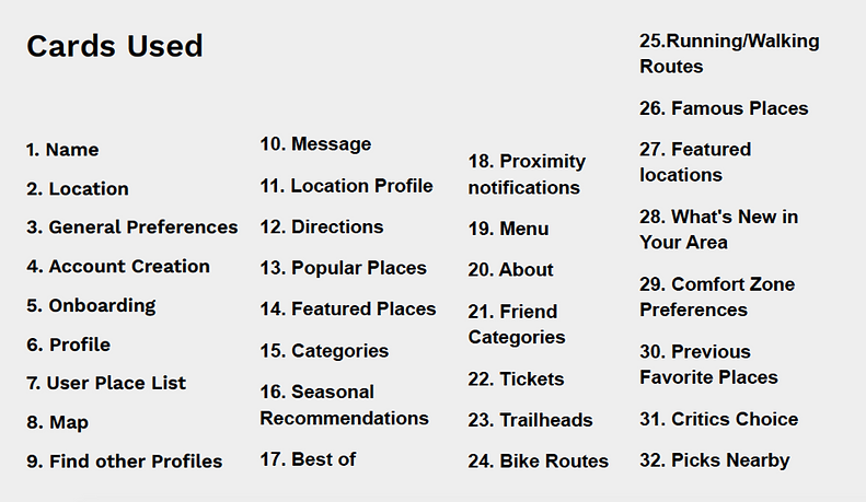
CARD SORT
A card sort was completed to help categorize the different elements of the labeling system and menus.

WIREFRAMES
Sketches and wireframes were made to begin to design the screen layouts and user flows. The design of the elements of the map portions are focused on simplicity and creating familiarity for users who have used other popular map applications.


VISUAL DESIGN
Typography, color, and other elements were chosen to help create a cohesive tone of curiosity and exploration. A UI kit was assembled to standardize the look and streamline the building of the screens.

03 TESTING
TESTING THE DESIGN
After high fidelity wireframes were created, a prototype was put together to conduct usability tests on three main tasks.

ISSUES DISCOVERED
After the usability testing there were a few pain points that were reported by the testers.
1
Some users noted that it took them a little while to figure out where the area to leave a review was.
2
The dashboard was a bit confusing to most users. The map and lists were on the same page and it wasn’t intuitive to use.
3
Almost all users were tapping the sign in button first rather than the sign up button when they were trying to make a new account.
CHANGES MADE

1
A “leave review” link was created to quickly bring the user directly to the input field to leave a review.

2
A separate page was made to make the difference clear between the sign in and sign up buttons.

3
A personalized dashboard with two tabs was created. One tab shows the users list and suggested locations, while the other is a map with icons for where those locations are geographically.
04 CONCLUSION
IDEAS FOR LONG TERM DEVELOPMENT
1. Add the ability to view other user's profiles so the user can view their favorite locations and discover new places through the community
2. Add a chat function so users can communicate within the app.
3. Create the ability for experienced users to be local guides who can curate lists of locations to promote local buisnesses and groups.
4. Create a more in depth section for outdoors activities, for example seasonal activities, hiking trails, swimming holes, mountain bike trails etc. These places can be difficult to discover without insider knowledge of a location.
5. Allow users to create their own locations. For example, picnic spots or other specific outdoor or indoor locations that may not show up on other map applications. This would help create a sense of community for users. Users who have created many highly rated locations could apply to be local guides.
LESSONS LEARNED
1. Listen and let the research guide the design. According to the research that was done, most people move to new locations because they want to and are excited about being in a place. When I was first beginning the project I assumed that people would be more nervous when coming to a new place and I thought I would be designing a product to help people feel more comfortable. Instead I focused on helping people find hidden gems more quickly since that seemed like more of an issue.
2. There's an interesting tension between people wanting to share their favorite places and those who want to keep them to themselves so that they don't become too crowded. For example, apps such as iOverlander that show users free camping spots are simultaneously incredibly helpful when traveling, and have the effect of drawing too much attention so previously hidden areas, which can ruin privacy and cause damage to sensitive environments. This is something to take into consideration when designing or using products that shine light on previously hidden spots.
bottom of page